Vincent van Gogh (Dutch, 1853–1890)
Cypresses, 1889
Reed pen, pen, and ink
When thinking of swirly mark-making and Van Gogh at the same time, "Starry Night" is the obvious painting that springs to mind but I thought I would choose the less obvious painting " Cypresses" to discuss.
In the picture, the variations in pattern apply to both the light and darkness of the shade and the curvature of the marks. For example, the hills to the right are distant so a more straighter, paler line is used whereas up close, thick and bold curves can be made out. The Cypress Tree is the focal point and much darker in shade, the darkest point being at the center which gives the illusion that this part of the tree is closer thus it being cylindrical in nature. The busy small swirls of different shades give a good impression of layered foliage and I see a lot of movement in this picture, like the wind is swaying the tree, whether that was intended.
Below is a picture of a Cypress Tree for comparison, and I can not help but feel that there is a chaotic loose feel to this painting upon comparing them. It is said that Van Gogh painted this picture on the ground of the Mental Asylum he was staying at, which may suggest this was during a manic stage of his illness.
 |
| Cypress Tree |
+Assignment+One+(Natural+Form)+Concept.JPG)
+Assignment+One+(Natural+Form)+Rough+Draft.jpg)
+Assignment+One+(Natural+Form)+Final+Piece+on+A2+Cartridge+Paper.JPG)
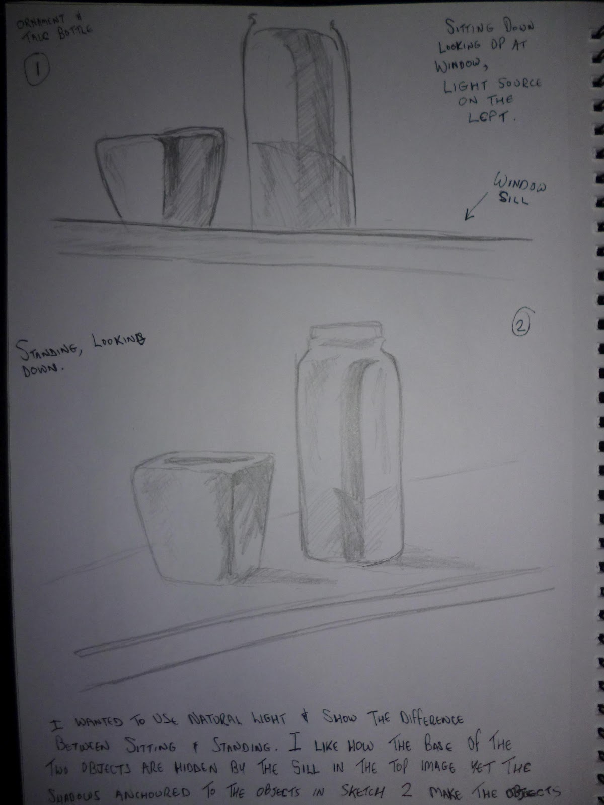
+Assignment+One+(Man+Made)+Concept.jpg)
+Assignment+One+(Man+Made)+Rough+Draft.jpg)
+Assignment+One+(Man+Made)+Final+Piece.jpg)
+subject.JPG)