Wednesday 23 January 2013

Assignment 3

Assignment 3

I started out preparing for assignment three by looking at all available viewing points to find a suitable candidate that would incorporate all the criteria for the assignment. I was looking for a view that showed depth from an aerial perspective, which was quite easy considering I live in a first floor flat. I was looking for trees, shrubbery, as well as walls and fences that showed a sense of perspective. Below were the views available to me. 

This view gave great coverage of the sky and cloud formations  however  the grass section is quite spaced out  and the  quality of trees were a bit limited to a fern on the left side.


In terms of perspective, this view was probably the best, where Burton Town can been seen 2 miles away in the distance. The narrow window framed the picture quite well and so I added the vase in the foreground and probably decided to include the window sill within the painting at this point should I choose this view. My main worry was the brown fencing which dominated the central part of the picture and I wondered if the picture would be too bare.


From the same window as the photo above but looking to the left.  I did not want to dismiss other  views but this did probably seem like the view that ticked all the boxes in the criteria. There is a spectacular tree and good structure with the house, plus the contrasting fences run alongside each other next to the house to give a good sense of perspective. I still wanted to do a view sketches to see how various compositions would pan out. 


Closer view of the tree and house, minus the window sill. 


The main obstacle with Composition One I found was how the tree was obscuring the house slightly, so I thought it may be best to simplify the tree a bit so the detail of the house could show through. I was concerned that there was a lack of distance with the piece, and very little sky, and I played about with the idea of shifting my position to the left slightly so the background behind the house to the right would show through, as in Composition Three.  Ultimately, I found that the bland mid-ground of Composition Two meant that I could not choose this view just because of the view in the distance and so I decided on Composition One,  with a more simplified tree.   

After sketching out the image, I dropped in the sky,  and began to work  background to foreground. 

The process would of been slightly easier had I not run out of masking fluid but I just had to be careful when painting around the vase in the foreground. The dirt path blended into the grass, soil and gravel crossing over into the grass so I opted to do that part wet on wet. 

The Final Piece Completed.


Reflection

In terms of my skills, I think I am improving in sketching and creating more realist tones, and I am enjoying the use of a solid 2B Graphite pencil and getting to know how to use it. For example, before starting a sketch, I would prepare the pencil by firmly rubbing one side against some sandpaper to create a wedge shape, that way, I have a sharp end for detail, and thick flat edge for shading. I am also constantly looking for different ways of using other mediums, for example with the charcoal Statue picture, I never would of thought of prepping the paper with a layer of smudged charcoal, to give myself the option of highlights by exposing the paper. 

I think I have at times relied on photographs for some of my outdoor projects where needed, but I have tried to use judgement and common sense as well. For example to give Assignment Three quite a bit of variety, I prepared myself by getting some great photos of autumn trees, or seizing the chance to sketch a castle like Warwick that I would otherwise not have. And in terms of letting me express myself more with watercolour and oil pastel, photographs have been quite valuable. 

In terms of the research portions of this assignment, I have tried to listen to tutor feedback and give more of my own opinions and not rely as much on material from the internet, to try and put myself in the place of famous artists and how they would approach their work and the difficulties they would face. I have thought about how time affects the artist, to Monet's emotional stress of Series work, to my own worries of finding the time to complete the exercises and it is probably true that all artists share common worries and fears regardless of their era in time or skill level. 

Overall, I think this Assignment has given me more confidence to actually go out and draw without worrying too much about what people think, and it is probably something I never would of contemplated without the structure of the assignment. I also feel that in terms of mediums to use, I am richer as a person and more willing to try oil painting and charcoal, whereas before the course, I was quite limited with what I was prepared to draw with. 


Friday 11 January 2013

Study of several trees P. 100

Study of several trees P. 100

For my study of several trees, I decided to use Oil Pastel as an alternative to watercolour and yet, being wintertime, I wanted to draw trees with a fair amount of foliage. I chose to use a royalty free image that captured the type of scene I wanted to paint, especially with the foreground grass quite prominent..


I was having a bit of difficulty blending the darker tones with Oil Pastel as it so different to watercolour which I am more familiar with, so knowing that the Oil Pastel lacked transparency, I thought of laying down darker tones which a black marker first, then apply colour later.


I started with lighter oil pastels then gradually built up the colour throughout the picture, adding layers of brown to the foreground grass. I have also found myself trying to be too detailed with oil pastel and it turns out messy so for the trees, I basically blurred my eyes to just generalize what colours were there. After applying my yellows, orange and browns, I moved on to the green foliage.


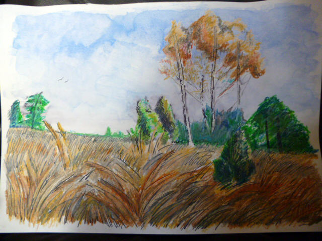
I am quite pleased with the completed piece considering this was a bit of an experiment on how to apply darker shade. For the more distant tress, I added some cool blues to the trees. I wished I had been more delicate with the trunks on some of the trees, using broken lines which work really well on the tall trees, but I was unsure how much coverage the oil pastels would give over the black ink. For the sky, I chose the subtle approach of using watercolour. I believe it has simplified the picture more especially in the formation of clouds. The added advantage being that I could practically go over the trees and not around them as oil in the pastel worked as the perfect waterproof barrier. 
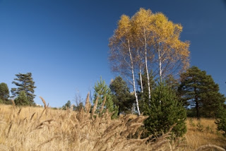
Royalty Free Image


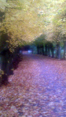
My photo took in early autumn 2012

I wanted to tackle this picture in the same way as I did in the one above, but with less black felt tip and only use Oil Pastel as colour. I also decided to try and mix oil pastel on the page more to see how it would blend as I knew it would be impossible to try and recreate all the leaves on the path.


I started in the same way as the previous painting and filled in the dark tones first before applying colour. Again, I blurred my eyes over the photo and tried to apply the oil pastel in this way.


I do not think the completed piece is as well done as the previous trees oil painting, and looks messy in places. Funny enough, I find the picture looks better from distance and the scratches on the path add much needed perspective. I feel that I am still getting to grips with Oil Pastels and perhaps this picture was a bit too big for me but I also think I am adding to my skills and learning about other mediums that I would never thought of trying.


Check and Log


  • How many different types of trees have you drawn?
Obviously, with it being in the middle of winter, in terms of doing still life, a lot of greenery is currently absent but it has helped that I planned ahead and did some preliminary work, especially during autumn time when the colours are bright and rich. I have used winter to my advantage and been able to study branch structure from still life while getting to use autumn colours from photographs I have taken. I think I have done well in getting a number of different types of trees in my study, especially with colour and texture and tried not to do too many pieces of all the same type. 
  • What techniques did you use to distinguish each type?
I have used charcoal and graphite for sketching the structure of branches and tried to use delicate shading to convey shadows and the perspective of branches coming towards the viewer. At the other end of the scale, I have approached other trees in a far more expressive way, using watercolour wet on wet, Ink on wet and Oil Pastel. With certain trees, I found that working more quickly and spontaneous was better in capturing the natural growth of tree, and in the case of watercolour on wet, I tilted the paper to let the watery paint naturally drip in the desired direction.
  • What did you do to convey the mass of foliage?
I guess in the case of sketching, a loose zig zag cross over mark created good foliage texture without the impossible task of trying to draw each leaf and it is more of a case of suggesting the overall shade of the foliage mass. In my pieces with colour medium, I tried to blur what I was looking at and to see where light and dark tones were placed within the shape. In terms of watercolour, a Fan Brush can help greatly in creating the overlapping layers of foliage and with oil pastel, the direction of the strokes helped to show which way the foliage was growing. Overall I tried to not to be too rigid with doing foliage as it looked very artificial.
  • How did you handle light on the trees? Was it successful?
With my individual sketch of a tree, I used a graphite pencil for my study, and I created light by leaving parts of the branches with just the white of the paper then shaded darker around it, and in terms of highlighting the finer branches, I put down a layer of smudged graphite then used an eraser to suggest the lighter branches. With Oil Pastel, I used tonal colours to suggest where light was hitting as well as leaving gaps in the foliage through which the background sky could poke through.
  • Did you manage to select and simplify? Look at your drawings and make notes on how you did this, and what could  you do better?
In terms of what to draw in still life, I would use a viewfinder or camera just to frame the subject to see how well the piece worked which helped in cutting off the edges, so to speak but with my sketch of an individual tree, I chose to completely remove the background as part of the sketch as with the amount of finer branches that I planned to put in using the eraser, it was likely that they would not show up that well with the background, and looking at the sketch, I think this was the right choice. As mentioned with the autumn oil pastel, I did deliberately try to not paint the fallen leaves as it would of been difficult. I do think perhaps I went a bit too minimal and made the piece almost abstract, especially along the path area. In contrast, with the painting of the royalty free image, I actually added clouds and birds just to give a bit of interest to the blue sky.


Larger Study of an individual tree P. 99

Larger Study of an individual tree P. 99


A page from my sketchbook, showing some the trees I have come across, using a graphite pencil.


I thought I would try a more expressive style for this tree, using black ink and water, waiting for the ink to bleed and allowing the paper to dry, I then applied more ink that would be left dry to add details particularly in the foreground.


I took the photo below back in September 2012 as I knew this tree would come in handy at a later date. The light seem to filter through in a quite hazy pattern and the naturally draped foliage made me think that this would make a good watercolour painting. I worked wet on wet, but used charcoal for the crooked tree trunk. I manipulated the flow of the watercolour by tipping up the paper, in the direction that I wanted the leaves to go. 


Sketching an individual tree P.98

Sketching an individual tree P.98

I took my time on this sketch and wanted to give the tree lots of depth and dimension, I did this by overlapping branches and breaking the shadow up on the underlining ones, making them look three dimensional. In order to add the more subtle branches, I choose to selectively remove the house in the background and make it more dark, I would then lighten the general tone of the tree and add shading to the background. Finally, I used a putty rubber to add in subtle branches, by exposing the white of the paper.


Completed Sketch, Duration : 2-3hrs, using a 2B Graphite Pencil


Although I draw the majority of the tree outline and main shade for life, once I had enough information, I sat down to do the more detailed tones, and also decided to remove the house and fence in the foreground.


With my sketch, I tried to emphasis the odd branch coming towards the viewer, this can not be seen as clearly  on the tree I used, so I used this other more prominent tree branch as a reference, in terms of shadow and tone.

Drawing Statues P.96

Drawing Statues P.96

The following sketches were done in Burton Town Centre and I sketched from life with all pieces, and once I felt as though I had enough information, I took photos and completed each piece from home using the photos.


I found this really interesting gravestone, that was stained and weathered, and I thought would make good tonal study. I did chose to darken up the background when I got back from home to help make the tombstone stand out a bit more.


I did this 15 min sketch, sitting on a park bench, from still life and felt quite conscious of the people walking past, but I tried to get as much information down about the subject as I could, including tones, light source and how the landscape was divided up. I probably have enough information to go on to make a proper painting but I did take a photo as back up.


Charcoal sketch of the statue on the left of the picture. I prepared the paper by grating some charcoal with sandpaper over it, and used a cloth to smudge the powdered charcoal evenly over the paper. Upon sketching in the statue, and adding shading, I then created lighter tones via use of a putty rubber, revealing the paper.


Check and Log


  • How did you use a limited colour palette to create a sense of depth?
I used stronger colour in the foreground, with more visually striking marks and tried to weaken the background both in colour and in mark making. The perspective of my lines naturally create depth with the scene I chose for this exercise as the buildings one side and the lampposts on the other, recede in the distance. However, going back to picture, I do think more can be done with it to create greater sense of depth and I plan work more on this piece.
  • Did your preliminary sketches give you enough information for your final pieces of work?
In places, I think my sketches have enough information, I was able to produce a decent watercolour and ink painting from a sketch I did at the beginning of this assignment. Although I would say that I maybe rely a little bit too much on photographs where perhaps I could take down more tonal information, or a colour test while outside, but I am still very conscious of drawing outside, and a photograph is probably an easy escape in all honesty. But I have become more at ease with drawing out and about, staying out longer as this assignment has progressed. 
  • Would you approach this task differently another time?
Probably just to try and relax more, and not worry so much as what people think you are doing. I also think the weather this time of year plays a big part in how much time you want to complete a task and you are more likely to be outside had it been summer. 
  • Have you got the scale of the buildings right? Make notes on what worked and what didn't.
I think the work at Warwick castle turned out quite well and I particularly like the detail on the tower. The townscape in line sketch is ok, but I was doing this in freehand and I feel that some of the lines are not as straight as they could be. I am happy with the work on the shopping centre, particularly the perspective of the building receding into the distance, it was just a shame that I felt it was not so good as a compositional piece, perhaps the shopping centre at a slightly different angle and in proper daylight would make a better picture. 
  • Have you captured the colour and atmosphere in your studies? How did you do this? 
In terms of the Watercolour Painting based on one of the Sketchbook walk pictures, I think I successfully captured the seasonal atmosphere I was trying to get by turning a dull late autumn picture into a more summer scene, by using more warmer colours and from personal experience, by adding people to the shopping center sketch, late night shopping just before Christmas sparked that uncomfortable feeling I used to get at that time of year, too many up tight people & crowds, getting a stress headache etc so it was not necessarily a  positive atmosphere I created by doing this.

A Limited Palette Study From Your Sketches P. 95

A Limited Palette Study From Your Sketches P. 95

In this exercise, I chose three colours as a limited palette ( Orange, Black, white ) and decided to work from a photograph in this instance. I also decided to merge some of the components from previous sketches into this piece


I thought this sketch would help indicate some of the dark tonal values that I had to include in my Limited Palette Sketch and I think it did help to simplify things.


My partner and her daughter, walking along the marina. I thought these two figures would compliment the  limited palette sketch below, partly because this is a space in the bottom right of the picture and both figure incorporate colours of the limited palette, black, white and orange. 


Original Photo that I chose to do the Limited Palette exercise from. I think black, white and orange seemed like quite common colours throughout the picture so they seemed like ideal colours to use.


After originally completing this exercise, I was quite happy with how it turned out but since then, I think I can add a lot more tone to the picture, whether that is pressing more firmly with the colouring pencil or mixing black with orange in places. I think I can bring the foreground forward a bit more with some stronger colour so instead of replacing this piece, I plan to do a side by side, to see if I can improve upon how it currently stands.

A Sketchbook of Townscape Drawings P.93

A Sketchbook of Townscape Drawings P.93 

I was fortunate enough to have a selection of studies to choose from in this exercise. Back in Sept, knowing that the Assignment of working outdoors was coming up, I had the opportunity to go to Warwick Castle where I was able to do a few sketches as well as take photos for future reference.


Warwick Castle : 2nd Sept 2012, 20 min sketch

Tower at Warwick Castle: 2nd Sept 2012


More recently, I chose to sketch a shopping centre, in Burton town centre.


I think my aim in doing this landscape as part of the exercise was to try and capture an emotion from drawing, and to focus on a busy shopping centre, around Christmas time, seemed like a good choice to provoke a response. I had a level of securing, sketching from inside of a car, but still, I remember suffering social anxiety in my teens and this is a situation I would find quite stressful. It reminded me of a time when I did not feel part of the moving social world, kind of separated from it all, and to observe and sketch the thing I would of found uncomfortable of years ago was unusual, but because I felt quite comfortable, it left me feeling empowered.


I do like this sketch, particularly the busy shoppers, which reminds me of Pissaro's series work with The Boulevard Montmartre and if I were to do a full sized study of it, I would have create character in it by adding stressed out shoppers.


Completely opposite to the previous sketch, here I referred back to the sketch I did in The sketchbook walk , only this time, I used a photo as a loose colour reference to create a watercolor piece.  I remember that the day was quite dull when I did the original sketch with quite an uninteresting sky, so I wanted to brighten this picture up with lots of warmer colours.


Study of a townscape using line P. 92

Study of a townscape using line P. 92


For this townscape study in line, I chose a clock tower in Burton on Trent.

Date: 4th January 2013, Time : Approx 2pm, Weather Conditions : Dullish and cool
Duration: 1hr


I decided to use quite a spaced out crosshatch technique for parts of this sketch, being that the building had layered tiled roofing which would suit the crosshatch and in terms of positioning the sketch, I wanted the clock tower to be slightly off center otherwise I would cut off some of the building to the lower left. Trees and bushes framed the building quite nicely and the perspective of the building was helped along by a street lamp and traffic sign each side of the road creating depth. I used stronger lines in the foreground for the road sign and curb and likewise, kept background of the building quite vague. In terms of shape, I found the building very useful, from the cube shape of the clock tower, to the triangles at various points of the building. The curved roads and circular flower bases added more variety.


Angular Perspective P.89

Angular Perspective P.89


In this attempt at Angular perspective, I tried to draw this shed like structure, freehand from the  view outside my window. Once I finished the sketch, I then used a ruler to estimate my eye level from two vanishing points. Firstly, I am clearly wrong with my angles of the shed as the the V.P.2 is much higher and V.P 1 is practically  horizontal. This would explain difficulty in getting the roof to line up correctly. I then predicted where my Eye Level would be and given a large enough piece of paper, I have estimated it to be around where the bracket is above the shed. Even though my proportions were completely out, I have found this a really interesting exercise in terms of double checking any buildings I draw in future.


Again, I have tried to create perspective on this sketch, without the aid of a ruler and I am quite satisfied with how it has come out. Once it was completed, I used a ruler to see how my natural lines converged. I am out slightly with the plant pots which I found quite difficult, sketching them into the foreground, but other than that, I feel this is far more accurate than the shed. 


Check and Log P.90


  • What problem did you find in executing perspective drawing?
In terms of freehand, having a reference point to start from. With the shed, I did the vertical line in the center fine but the lines of width and depth were not level so it twisted the shed slightly. With the image of the marina, I was able to start with the building at the far end and build outwards from the door, using the plant pots  buildings and lamps as a guide until I was at the foreground. This way seemed more simpler for me to judge the perspective.  
  • Makes note on the merits of using or not using, rulers to guide you.
I am a bit puzzled as to whether a ruler is classed as cheating or indeed if there are any rules in art at all. A ruler will obviously give you straight angles and a level of accuracy that can not be achieved freehand, but does this take away the human touch from a picture and make it more of a diagram ? To play devils advocate, as an aid to the artist, the use of a ruler is not so much different to using a grid to enlarge a picture because without either tool, the artist would have to use their artistic skill to estimate. Then I hear ( on the Drawing and Painting Channel ) a professional artist say that a ruler was ok to use on his painting of a bridge because it was a man made structure, and it would not look right freehand, so I am unsure were the merits lie either way  On the same channel, and used by professional artists, was something called " Trace Down", tracing paper with a layer of carbon, so you can create an image without the use of sketching, so if artists are fine with this, the consensus seems to be that creating art is whatever you want it to be and use whatever tools you have available to you.