Thursday 29 November 2012

Assignment Two P.71


Assignment Two

When selecting the type of composition for this piece, I went through Five phases but I initially looked at doing a display of red onions, in Oil Pastel, I found the "scratch" technique done in my learning log, really interesting and something I wanted to come back to on a proper project piece but I decided, based on the Check List for Assignment Two, it did not really tick enough of the boxes, doing objects of a similar colour in repetition, so I thought I would combine a couple of what I feel are my strongest pieces, "Pastel Wine Bottle" and "Fruit in Colour/Hatching" to create a composition that included a Wine Bottle, but using Pencil Colours. I also chose the flowers I was also planning to use on the "Drawing Plants/Flowers" Project before finding the wooden roses. Firstly, I just set about organizing my objects into a composition I thought may look interesting.

Phase One : I thought the glass worked well on my previous piece but this time, I decided to fill it part way to add some colour,  and I lay the flowers in a manner that I hope would create depth. I was already at odds with the background, whether to have it patterned or just use part of whatever was in the background. This was the first display I came up with and decided to quickly sketch.

Originally, I was thinking of doing a Landscape Picture to take away some of the gap above the bottles but I realized it was the background I was not happy with. Also, the wine bottles I had available were too similar in size so I felt the need to change things. At this point, I was very happy with the wine glass and the flowers but I was weary of the gap each side of the composition from my perspective. (the pictures were taken lower down but it was too uncomfortable for me to kneelled down to paint ). At this point, I decided to change positions onto a table, were I could also change the background.


Phase Two : Low Down Photograph of how I would of attempted this piece if I able to.


Phase Three : I moved my display over to the table and set up the DVD shelf at the back as a bookshelf, I also did a bit of research into how other artists have approached bookshelves before, see following website http://bookdirtblog.blogspot.co.uk/2012/02/paintings-of-bookshelves-almost-as.html . Once I had figured out that I had a suitable background, I moved onto my objects. I probably decided at this point that this would be of portrait orientation and made the tough choice of removing the glass in favor of a lager bottle, because I thought an object that was slightly smaller and sleeker would take up less space.  


Phase Four : I think once I decided to make this piece a portrait, I was looking at balancing out the picture a bit more, the flowers looked top heavy at the bottom and the white wine bottle looked too similar to the red, so I wanted to see if I could make the flowers taller than one of the bottle by using a vase. I took a photo as if using a view finder and the composition finally started to look more balanced as seen above. 


Tonal sketch of my composition. As I was colouring in the table, it gave me the idea that maybe instead of having a patterned background, this piece could have a patterned base, especially considering I have the wood surface in quite a lot of my work. I wrote down a few notes about what I was concerned about, the positioning of the three objects for example.

Phase Five : Chosen Composition.  Probably the closest photo to the perspective that I had , just to the right of the picture, I included a lightly patterned base and added a couple more books on top of the shelf.


Completed Assignment.


Reflection

Overall, I have tried to follow the checklist for Assignment Two and hope I have covered everything. If I were to break things down, in terms of "Use of colour", I think I have learnt a lot compared to Assignment One. How I have approached colour has been totally different, I have tried to blend colours from primary colours or colours that are already on the paper as opposed to selecting that colour from a crayon, which gives the picture a more harmonious feel. I do think the colours could be richer on the paper and perhaps I have been too careful there. In terms of "choice of medium", I would say that I have "achieved what I was trying to achieve " in terms of the shading and crosshatch mark within the picture. If I had of used Oil Pastel, Pastel or Watercolour, the outcome would be very different I think, it would been a much bolder piece, not so much on the shading. My skill at using my chosen medium is a "work in progress" I would say, some of my work with Pencil Crayons has come out really well, sometimes, not so well so I would say it is a medium I still need to learn about. I guess in terms of "setting up a composition", I think about it a lot more now, before it was probably more about the focus of the object in question, now I am looking at framing the piece, how the object relates to the background and base more and not just the object in the center. I would like to think that my biggest improvement since doing Assignment One, would be my tonal work, it has been hard to break the habit of using so much black in my work and in a way, I have had to reprogram myself. For example,  I have learned to build up tone and did this with dark blue on this picture.Yet I think my contrast could be a lot better, the picture does not seem dark or light enough in places compared to the "Fruit in Colour" exercise I did which does look rich in contrast. Had I used the flowers laying down, I would be more confident with the depth which may lacking in places as it currently stands. I have tried to be more accurate in my work also, I used a ruler to plan out the piece and made sure all of the angles of the bookshelf and  bottles were correct and this is something I will do from now on. I would not say I am completely happy with my ellipses which I still need to work on but generally, my shape in objects is getting better.

If I were to be honest, this piece is not one of my favourite that I have done, I think my Watercolour on Wax and Fruit With Colour Pieces are better in terms of tone and contrast, but I can see improvements in the way I have gone about my work in through Assignment Two, and my understanding of Still Life is much better informed.


Tuesday 20 November 2012

Fish On A Plate P. 69

Fish On A Plate  P. 69

I chose this Mackerel because I really like the markings along the back and I found this exercise very interesting because I had never drawn a still life of a fish before. In all honestly, drawing the fish was relatively simple but I had real difficulty in drawing the plate, I just could not get the ellipse right, and I still do not think it is completely right now. I even used a ruler and created a diamond shape to assist me in doing the plate but it was still difficult. I am pleased with the result, I could of so easily gone overboard with the black shading but found myself trying other colours to blend to make a dark tone instead of using black because in reality, the fishes dark markings were not true black either, just a mixture of colours.


Check and log

What were the main challenges of drawing animals

Obviously drawing a moving animal forces you rely on your short term memory as it moves around, or if you are drawing an animal coming towards or away from you, then getting an accurate perspective is key as well as getting proportions correct, this means drawing accurately and quickly at the same time. I do not know if this is right to say but it is also hard to get that spark of life from an animal, is it in the eyes or how it moves, and how would this differ from the "Hare" that Dürer painted which was allegedly stuffed. I think that texture can be difficult to draw, whether it is the shine from scales on a fish, roughness on a crocodiles back or fine fur on a lion.

Which media did you enjoy using most and which did you feel were best for the subject matter and why?

It would depend on the subject matter I should think, in terms of my "Fish on a plate", watercolour was the best medium for me to use on a mackerel. I was able to pick out the iridescent colours that the scales produced and the transparent qualities of watercolour complimented this. My wolf on the other hand works well with pastel as a characteristic of the wolf fur was to blend at various points either through shadow or the layers of the fur. The pastel still had the richness to apply distinct marking that the wolf has. In terms of capturing movement ( for me, my subject, Mollie the cat) then charcoal was the most productive. Having the advantage of Mollie being black and white helped, as I could quickly shade sections of her fur in as well as blend to grey where light hits the black fur.


Where can you go to draw more animals? Think about the sorts of places that will give you opportunity for animal drawing. Have you tried drawing a moving animal Yet?

I think you have to get a bit ingenious to draw animals, there is a selection of domestic pets that you or your friends have that you can draw. Then there is the spontaneous such as what you may see by a lake or an nature walk. This could be a good way of exploring nature but there is no guarantee of what you may or may not see. Zoos and farms can give you access to some interesting animals, as would a sea life center. A beach or area where there are rock pools would be a good place to draw marine life and there is always a museum that sometimes have an area with stuffed animals. The ingenious part comes from thinking outside the box, why not draw moving animals from wildlife programs on the TV or when opportunity arises, capture local wild life on your camera phone. There are books and of course the internet which is a treasure trove of royalty free images to draw from.

Anatomical drawings of George Stubbs 17724 - 1806

Anatomical drawings of George Stubbs 17724 - 1806


Born in Liverpool, Stubbs was predominantly a self taught artist who worked in the leather industry with his father. During the1740s he worked as a portrait painter in the North of England and studied human anatomy at York County Hospital a few years later. As a child he had always been interested in anatomy and in 1756 he rented a farmhouse in Horkstow, Lincolnshire, where he would dissect horses, hanging them from the rafters to study their anatomy layer by layer, skin, muscle to bone. In 1766 he published The anatomy of the Horse. It was this profound knowledge of horse anatomy that allowed him to produce some the most detailed horse paintings in history.


Image 1

Image 2

Image 3

It is almost visible to see the skeletal structure of the horse given that the skin is so thin, Stubbs was able to add this level of detail to his finished pieces, such as the muscle structure from the first image, the veins and ribcage from images 2 and 3 and the cartilage in the legs, giving a truly accurate depiction of a horse


http://www.albion-prints.com/george-stubbs-anatomy-of-the-horse-1766-lg-folio-etching-1st-edition-13-19241-p.asp
http://www.royalacademy.org.uk/ra-magazine/winter2006/preview/horse-play,42,RAMA.html
http://www.albion-prints.com/george-stubbs-anatomy-of-the-horse-1766-lg-folio-etching-1st-edition-4-19243-p.asp
https://picasaweb.google.com/lh/photo/avQmZqQyYvZ4A4GhIuTzHg

Grabbing The Chance P. 67

Grabbing The Chance  P. 67

I was a little bit apprehensive at the thought of doing this exercise, and I was probably expected it to turn out quite badly, working on a larger scale with a moving animal but I think the good thing about charcoal is that it kind of gives you confidence and to try bold strokes. I thought the best way to get my subject into position was to bribe her with food, and so I was able to bring her bowl into the living room. I felt like I was on a clock counting down though, how long it would take Mollie to eat her food before leaving the scene so I quickly got to work.

I am starting to really like Charcoal, especially the willow sticks, which I find not that messy, so much so that I have some ready in a small plastic box should I spot the cats behaving in an interesting way. I think that Charcoal sketching is something I am keen to continue on a regular basis because of its versatility.


Quick charcoal sketch of Mollie, eating her dinner. I like the freedom of the strokes, the way I smudged certain areas to create shadow, the marks on body to indicate fur and the character I have brought to the piece, Mollie with her head firm in her bowl.
Mollie in the window - I am working much faster here than on the above picture, Mollie is free to go whenever she wants and is wondering what I am doing.

It is a challenge to get Garfield in one place, without being asleep so on this rare occasion, I did a quick sketch. Due to it being in the evening, in low light, Garfield's eyes had dilated quite wide so I wanted to exaggerate this a little, like the stripes of his tail that are not as distinct. I think this is a very charming sketch with lots of Garfield's character.

Apart from the bottom right Chimp, these are sketches done from moving animals on the TV, from a wildlife program, the below sketch was a 15 min sketch from a paused image.


The Work Of Nicola Hicks (born 1960)

As a point of reference and something for me to keep looking at, I have included some work by Nicola Hicks ( recommended by my tutor). This work on animals is amazing, the detail and character she captures from the subject.


Research : Leonardo and Dürer depiction of animals

Research : Leonardo and Dürer depiction of animals


Both Dürer and Da Vinci had a unique respect for animals, Dürer for example would draw animals as full pieces of art whereas at that time " Critics felt that the painting of animals was simply a demonstration of technical skill " and almost seen as a study exercise. it was not until 200 years later, when George Stubbs came along that the subject of animals in art was elevated in higher regard. Dürer wrote "Nature holds the beautiful, for the artist who has the insight to extract it. Thus, beauty lies even in humble, perhaps ugly things, and the ideal, which bypasses or improves on nature, may not be truly beautiful in the end." That was his passion for nature and the truth he seeked, he believed he would find in the natural world. At that time, explorers travelling around the world bring back new species, so animals could be seen as new material for an artist to use.

Da Vinci likewise had the same respect for animals, he predicted that they would have the same rights as humans in time, long before such ideas had gained widespread acceptance.He became a vegetarian which was very rare at the time and even though he dissected many humans as part of his study on human anatomy, he hardly did the same studies with animals. It is said that Da Vinci loved animals so much that he would buy  caged birds simply to let them go. Probably the main difference between how both artists depict animals, it that Da Vinci is studying form and movement with the animal, almost like animation whereas Dürer's work is probably more portrait like, there is colour in many of pieces and the subject is in a more posed position


Having not actually seeing a Rhinoceros himself, but from someone else travelling abroad, Durer 's depiction had a  second horn on top of the neck and being quite literal in terms of the tough body of the rhino, it contained panels of armour. 

Gazer  by Albrecht Dürer


The Little Owl 1508 by Albrecht Dürer


Rearing Horse by Da Vinci
Studies of crabs - Leonardo da Vinci

Study Of Horses by Da Vinci


http://www.wikipaintings.org/en/leonardo-da-vinci/studies-of-crabs
http://drawsketch.about.com/od/leonardodavincidrawings/ss/leonardo-da-vinci-drawing_2.htm
http://www.codex99.com/illustration/90.html
http://www.wikipaintings.org/en/albrecht-durer/garza
http://www.metmuseum.org/toah/hd/durr/hd_durr.htm
http://jwstudio.tumblr.com/post/21692055075/albrecht-durer-an-owl-1508-via-new-animals

Drawing Animals P.66

Drawing Animals  P.66

Cats seem to be a good choice for me to try and draw with having two ourselves and having spent a couple of days watching their behavior and movement, I feel I am ready to have a go drawing them. As with any skill, the more you try something, the better you get and I have noticed this when drawing Mollie. The shape of her head, body and tail become familiar. Here are some attempts at drawing her.


Mollie eating her dinner

I started by sketching a few connecting circles just to get Mollie's proportions down before  adding basic outlines As you can see, I started with the head because while she was eating this part of body was moving the most so I wanted to get that down as soon as possible  Mollie stayed eating in that position for quite awhile and I was able to continue with the rest of her body


Completed sketch of the picture above, I used some crosshatch marking for the wall in the background and a bit of shading around Mollie's bowl to indicate a cylindrical shape I like how the door frame and scratch post frame the picture


Having bought a book " The Fundamentals of Drawing Animals" by Duncan Smith, he highlights the importance of being aware of simple anatomy when drawing animals because a lot the time, be it cat, dog or horse, the skeletal structure is similar so I attempted to estimate the structure of Garfield because to know this basic information is to know how to draw the animal, whatever the position

Top Left - Mollie in the window sill, it seems to be a good  place to catch her as she tends to stay in one position in the window quite a lot. Bottom Left - Casper sitting in a low down window sill, the low afternoon sun created a long shadow on Caspers body. Bottom Right - Garfield relaxing on the floor, his normal position was to keep his head flat to the floor but I managed to catch this sketch of him looking up (which he did numerous times)  Top Right - Again, trying to create the skeletal structure of Garfield

Casper (Pure White Tom) being quite playful so I took the opportunity to do some quick sketches of him looking in different directions and at different distances


My preferred style for drawing animals are from photographs, this is done using Pastel Pencils on coloured pastel paper . I chose a colour of card that would compliment the wolf and even allowed gaps on the paper for the grey to show through.


Drawing With Other Colour Media P.65

Drawing With Other Colour Media  P.65


With this project, I really wanted to try something different. I remember at school, stretching a fabric similar to Muslim Cloth, dripping a hot wax which then cooled and adding various dyes which seeped across the cloth for which the wax acted like a natural barrier, the effect was really interesting So as my Mixed Medium, I have chosen wax crayon with watercolour 


I started by using wax crayons to shade in a bit of tone to my still life sketch. Where there were highlights, I applied white wax crayon (which obviously can not been seen here)


I then treated the Still Life as a regular watercolour and just let the wax do the rest. I knew I had a bit of freedom to load the brush with paint as I knew where some of the white natural barrier would be. I may of gone a little overboard with the background but I had no idea the wax effect would work so well. I think the colour in the fruit has blended really well and if I were to be critical, I would darken parts of the passion fruit slightly that is in shadow and maybe define the the base of the bowl a little more.

Check and Log

How will your experiments with negative space help your observational drawing in the future?

As mentioned before, seeing things from a different perspective would surely help improve accuracy in observational drawing and it could be argued that the mind may sometimes go auto-pilot when drawing familiar images and attempt to fill in the blanks without seeing what is really there. By focusing on the negative space, the artist is focusing on shapes and objects that are less familiar.

What techniques did you use to ensure you drew your plants in proportion?

I would first try to get the stem drawn correctly then very lightly represent each leaf as a bubble shape, making sure it is in the same orientation and position as the leaf. When all bubbles are correctly in position around the stem, I would then start to draw the shapes of the leaves, starting from top to bottom. When working a larger piece, such as A2, like my flower arrangement for example, I would use a ruler to measure the height of the flowers in proportion to the vase and find the half way point.

How did you achieve an effect of three dimensional space in your drawings?

I think this all starts with the direction of light, with that you can plan the direction of the shadow, and as the light hits the objects, tones and highlights are created as the light reflects and curves. With this information, you can add in the shadows, tones, mid tones and highlights to give you a realistic representation of a three dimensional object.

Plants and Flowers in Coloured Pencil P. 64

Plants and Flowers in Coloured Pencil   P. 64

Before attempting my flower composition, I wanted to get know my new Polychrome Colouring Pencils, how they blended and how they could be layered, how the crosshatch technique would change the base colour. I felt that if I knew more about what these pencils were capable of, I could produce much better work. I kept this testing sample next to me while doing the piece.


Originally, I had in mind to use a selection of round daisy like flowers until I saw this artificial rose bouquet that was just too interesting to pass up. The stems were wire-based and quite poseable, the main bunch was woven together in an intricate way, with stems of long grass exploding out from the center. I though about negative space and how the grass stems would produce this and thought it would make a good composition. The petals were made of wood flake, and had a pinkish hue on them and I thought I would use this colour throughout my piece. To compliment the flower and rectangular vase, I used two objects on the table of different shapes, the egg cup to the left and the pink candle to the right. I placed the egg cup with a deliberate space between the vase and chose to set the candle further back, tucked slightly behind the vase to add depth. I also used a lamp to illuminate the vase which cast a very interesting shadow on the wall.

My chosen composition


I am very pleased with how this turned out, hopefully I think I have gotten rid of the habit of using too much black in my work now and that I can stick to using tonal colours to highlight edges etc. Even thought the flowers were artificial, I think it was the perfect choice due to the interesting effect that the grass stems have, which make the picture stand out more. I also like the magnified effect through the glass vase, of the candle especially. My crosshatch work seems to work quite well and I believe I have successfully created a good reflection off the table. The part I am most unsure about is the background, not the shadow, which I am very happy with but whether to include the TV or not, and whether it should of been turned off. I opted to leave it on to get a more silhouetted effect. 


Close of the main bunch of roses.


Negative Space In A Plant P 63

Negative Space In A Plant  P 63


Originally, I planned to draw the negative space of this picture in the window sill, as it created a good silhouette but it was a bit too far away and too impractical so I got the idea to draw the vase of flowers in low light in front of the TV. From my perspective, the detail of the flowers was completely silhouetted which I think helped me in drawing the space around the object and not the object itself.


It was quite an enjoyable exercise, not drawing the flowers and there was a point where I was worried that the triangles in the center would not match up to create the stem. I also found it interesting that as I continued down the page, instead of ending the picture, I began to draw the silhouette of the table at the bottom, and the onion popping out on the right,  but at the time it was how I saw the shape. Also since doing this exercise, I often look at objects in a different way, for example, I would stare at my hand, fingers outstretched but looking at the shapes the gaps between the fingers make so I guess this exercise has provided me with a different way of looking at things.

Ben Nicholson P. 62

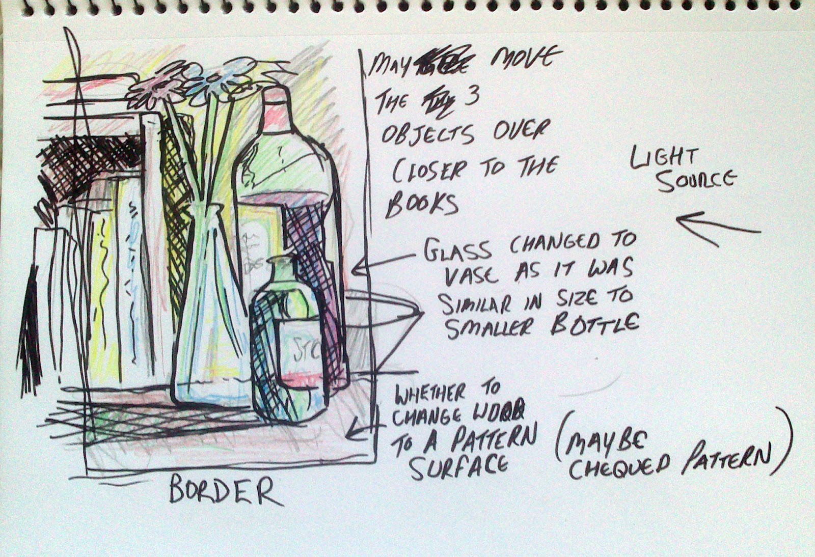
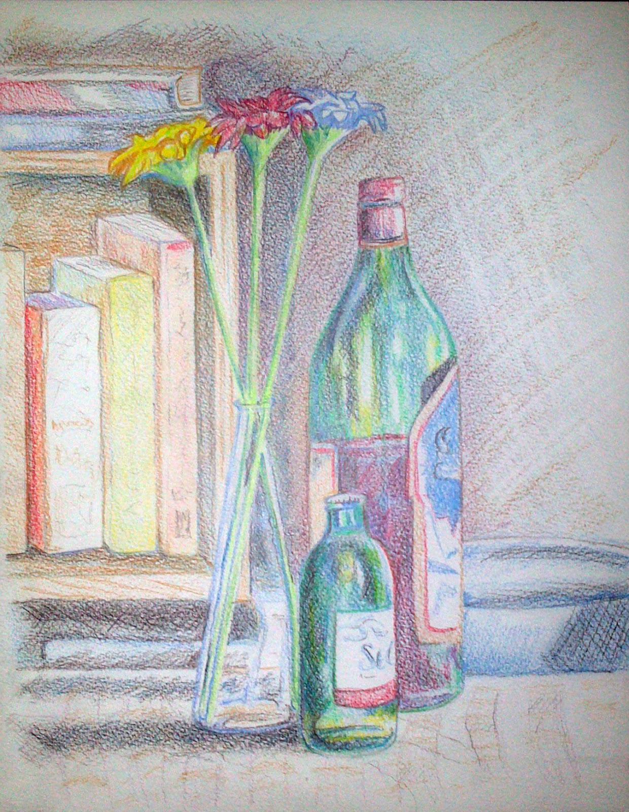
Ben Nicholson simplify still life forms and negative space P. 62  

Ben Nicholson:  Mousehole 194

Born in Denham, Buckinghamshire in 1894. Ben had a lot to aspire to having parents who were both artists. His mother was Mabel Pryde, his father, William Nicholson, who met each other at the Bushey School of Art. William would go on to a be a great poster designer in his own right.

Having studied at the Slade School of fine Art, Ben became quite a worldly person, travelling in Europe and America and in 1920, he married Winifred Roberts, an impressionistic artist. Despite adopting a style of art similar to his father, Nicholson's first exhibition in London 1922 was of a more figurative piece influenced by Synthetic Cubism and Post Impressionism.

Then whilst in France, he met Picasso, Braque, Brancusi and Arp and so further peaked his interest in Cubism and Abstract art  On Subsequent visits he met dutch painter Piet Mondrian, who introduced Ben to the artistic movement of De Stijl or Neoplasticism. This utopian style of art would seem quite refreshing to Nicholson, the simplicity in colours and form, and the order that the geometry created. From the places he had traveled and the people he had met, Ben Nicholson was able to incorporate the various styles he came across and add them his own technique in a plausible way.

The above picture is of "White Relief", the first wood relief Nicholson made in Paris in 1933

In 1937 he became editor of Circle: An International Survey of Constructivist Art, along with Naum Gabo. After the breakdown of his marriage, Nicholson lived in Cornwall with Barbara Hepworth from 1939 to 1958. Fleeting between abstraction and figuration art work, Nicholson used cool, natural colours, soft textures and precise interlocking shapes. Then in 1945 he moved from making reliefs to working on linear, abstract paintings. Having married for a third time and moving to Switzerland, Nicholson eventually moved back to London where he died in 1982.


Why does he simplify still life forms and negative space and superimpose them on the Cornish Landscape? 

In all honesty, I am unsure why Nicholson does this because I have not found a definitive answer. But in my search I have found possible reasons but again, this is just speculation and only an opinion. From a psychology and sociology standpoint, I think the reason why people act in deliberate ways is through their peers or of people of influence in your life, both positive and negative. If we look at the obvious, Nicholson is very influenced by Picasso, Mondrian, Braque etc and part of his personality is to learn new skills from others and then combine it with what he knows which may indicate an unhappiness or unsatisfaction with himself or work, and the need to keep improving. Another reason could be that of his first wife, Winifred, an impressionist artist herself who clearly had some shared influence with her husbands work, for example, see how they paint from inside the window.

 Winifred Nicholson, From Bedroom Window
Ben Nicholson 1946 St Ives


Personally, I think Ben Nicholson alters the Cornish Landscape as a means to get away from his fathers style of drawing. Coming for an artist family, there would be pressure to succeed and even a bit of rivalry of any success gained. Sanford Schwartz suggests that " one reason we are now so uncertain of where to rank William is the constant denigration he suffered from Ben, who felt the need to dismiss his father so that he himself could take the commanding place he felt he deserved" and that "Being regularly combative and jealous of Ben’s own reputation, William was savagely scornful of his son’s early efforts. Ben’s jealousy may well have derived from William first gaining fame as half of a two-headed monster, the Beggarstaff Brothers,"  (The Times, 2004)

The relationship with his father may not be the sole reason for how Nicholson paints but it is possible that this feeling to disassociate himself made him more susceptible and enthusiastic to explore other movements. It is possible that he felt as though traditional styles of painting did not convey all that was there, and the cubism approach lets the viewer see different aspects of the Cornish Landscape from mulitple angles while the negative space served to draw the viewer into the detail of the painting. It could also be that Nicholson wanted to incorporate his abstract approach to a traditional landscape as a way of getting his style recognized more in the mainstream,  it is said he had the belief that abstract art should be enjoyed by the general public.Finally, it could also be argued that Nicholson turned to landscapes in order to earn a living during the war years, switching from relief to linear at the end of World War 2.

I am still unsure of why painted the way he did, but it seems to me that because of all that influenced him, made him see the world in a particular way, poetically put in this quote:

Outside his Cornish studio the world must have seemed exceedingly disorderly: most days the sky going by at a tremendous pace; the sluicing of waves and exploding of breakers, that endless pitiless tugging at the headlands by the sea; prevailing winds, quoits and stone hedges; the underworld of tin lodes; the hardship of it all, generation after generation; harbors  like churchyards, bobbing with coffins.  Only very slowly did this have an effect on what he was doing.

                                                                                             Christopher Neve, Unquiet Landscape


Information Sourced From :
http://cma.staging-thetimes.co.uk/tto/arts/article2399623.ece
http://www.tate.org.uk/art/artworks/nicholson-1936-white-relief-sculpture-version-1-t07274/text-summary
http://www.artrepublic.com/biographies/85-ben-nicholson.html
http://gerryco23.wordpress.com/2010/12/03/ben-nicholsons-cornwall/

Drawing Using Oil Pastel P.61

Drawing Using Oil Pastel  P.61

For this exercise, I really wanted to fill the paper with colour, and I thought the strong colour of peppers would make an excellent composition to draw. I wanted to get away from fruit or veg that blended from one colour to the next, I thought of using grapes or tomatoes but but found they had not enough variation for what I wanted to do. For the background, I was looking for something that was quite colorful but not a repetitive pattern as such, and I found my daughters fleece throw over, which was a bold, large scale cartoon picture, I positioned it so that it would not necessarily be identifiable as a cartoon image. I then positioned the peppers in a way that would compliment and stand out against the background. For example, I did not want the yellow pepper on the right because of the yellow background and likewise with the green. Logically red would go in the middle and I positioned the peppers at different angles to one another to show different form.


Original photo of my piece. From my perspective, the peppers were probably not as brightly lit as they are on the photo, and my view point was more to the right.


I did my best to leave white paper showing through and get the graduated effect that the exercise asks for, this is quite apparent in the red pepper and at various points around the background. I resisted the urge to add shadow as such to the base because the fleece was not really picking much shadow up, the tips of fleece had a slight sheen which I tried to suggest via the scratching technique where a shadow would be. I also wanted to give the suggestion of the creases at the edges of the fleece without using too darker colour, so I applied white pastel over the darkened tone to give a smoky effect. This is probably the most "abstract" piece of art I have done, as I like a picture to make sense, but with this, I thought I would let loose slightly and let the shapes shine through a bit more, whether this is a successful piece, I am unsure, as I often change my mind as I look at it.