Assignment Two
When selecting the type of composition for this piece, I went through Five phases but I initially looked at doing a display of red onions, in Oil Pastel, I found the "scratch" technique done in my learning log, really interesting and something I wanted to come back to on a proper project piece but I decided, based on the Check List for Assignment Two, it did not really tick enough of the boxes, doing objects of a similar colour in repetition, so I thought I would combine a couple of what I feel are my strongest pieces, "Pastel Wine Bottle" and "Fruit in Colour/Hatching" to create a composition that included a Wine Bottle, but using Pencil Colours. I also chose the flowers I was also planning to use on the "Drawing Plants/Flowers" Project before finding the wooden roses. Firstly, I just set about organizing my objects into a composition I thought may look interesting.
 |
| Phase One : I thought the glass worked well on my previous piece but this time, I decided to fill it part way to add some colour, and I lay the flowers in a manner that I hope would create depth. I was already at odds with the background, whether to have it patterned or just use part of whatever was in the background. This was the first display I came up with and decided to quickly sketch. |
 |
| Originally, I was thinking of doing a Landscape Picture to take away some of the gap above the bottles but I realized it was the background I was not happy with. Also, the wine bottles I had available were too similar in size so I felt the need to change things. At this point, I was very happy with the wine glass and the flowers but I was weary of the gap each side of the composition from my perspective. (the pictures were taken lower down but it was too uncomfortable for me to kneelled down to paint ). At this point, I decided to change positions onto a table, were I could also change the background. |
 |
| Phase Two : Low Down Photograph of how I would of attempted this piece if I able to. |
 |
| Phase Three : I moved my display over to the table and set up the DVD shelf at the back as a bookshelf, I also did a bit of research into how other artists have approached bookshelves before, see following website http://bookdirtblog.blogspot.co.uk/2012/02/paintings-of-bookshelves-almost-as.html . Once I had figured out that I had a suitable background, I moved onto my objects. I probably decided at this point that this would be of portrait orientation and made the tough choice of removing the glass in favor of a lager bottle, because I thought an object that was slightly smaller and sleeker would take up less space. |
 |
| Phase Four : I think once I decided to make this piece a portrait, I was looking at balancing out the picture a bit more, the flowers looked top heavy at the bottom and the white wine bottle looked too similar to the red, so I wanted to see if I could make the flowers taller than one of the bottle by using a vase. I took a photo as if using a view finder and the composition finally started to look more balanced as seen above. |
 |
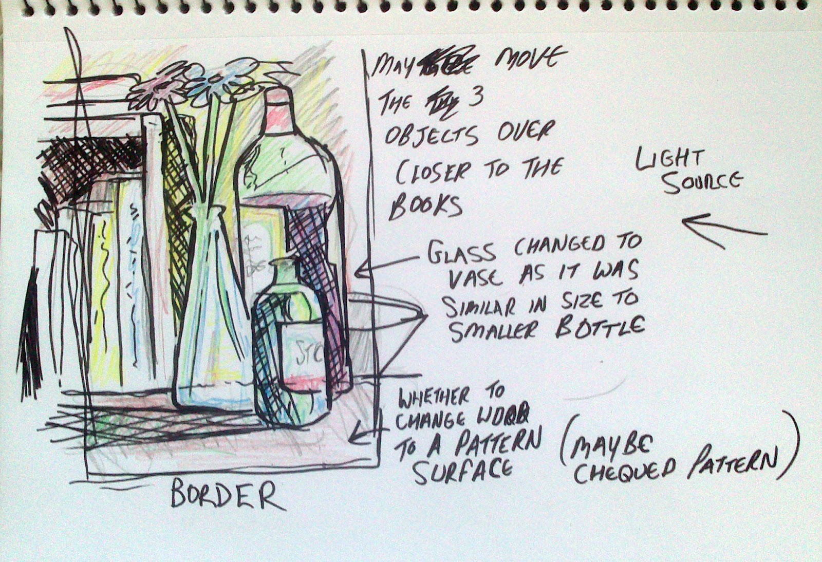
| Tonal sketch of my composition. As I was colouring in the table, it gave me the idea that maybe instead of having a patterned background, this piece could have a patterned base, especially considering I have the wood surface in quite a lot of my work. I wrote down a few notes about what I was concerned about, the positioning of the three objects for example. |
 |
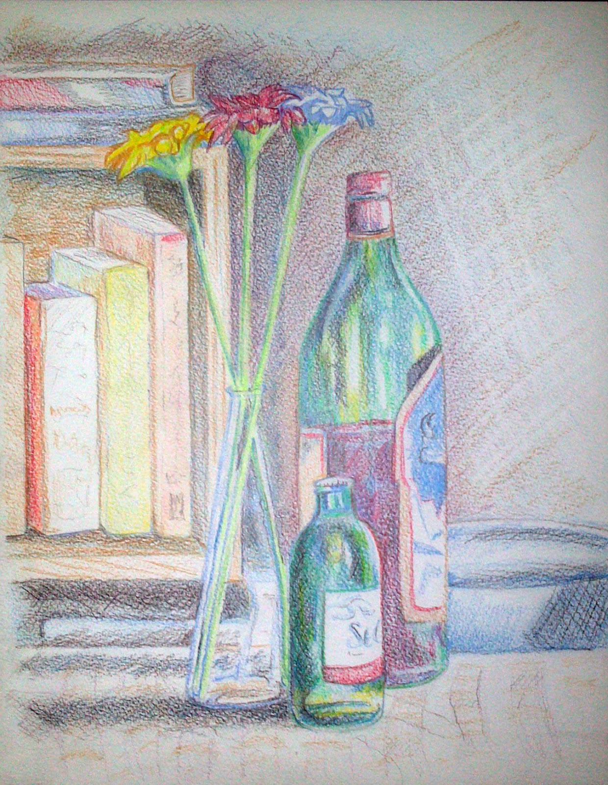
| Phase Five : Chosen Composition. Probably the closest photo to the perspective that I had , just to the right of the picture, I included a lightly patterned base and added a couple more books on top of the shelf. |
 |
| Completed Assignment. |
Reflection
Overall, I have tried to follow the checklist for Assignment Two and hope I have covered everything. If I were to break things down, in terms of "Use of colour", I think I have learnt a lot compared to Assignment One. How I have approached colour has been totally different, I have tried to blend colours from primary colours or colours that are already on the paper as opposed to selecting that colour from a crayon, which gives the picture a more harmonious feel. I do think the colours could be richer on the paper and perhaps I have been too careful there. In terms of "choice of medium", I would say that I have "achieved what I was trying to achieve " in terms of the shading and crosshatch mark within the picture. If I had of used Oil Pastel, Pastel or Watercolour, the outcome would be very different I think, it would been a much bolder piece, not so much on the shading. My skill at using my chosen medium is a "work in progress" I would say, some of my work with Pencil Crayons has come out really well, sometimes, not so well so I would say it is a medium I still need to learn about. I guess in terms of "setting up a composition", I think about it a lot more now, before it was probably more about the focus of the object in question, now I am looking at framing the piece, how the object relates to the background and base more and not just the object in the center. I would like to think that my biggest improvement since doing Assignment One, would be my tonal work, it has been hard to break the habit of using so much black in my work and in a way, I have had to reprogram myself. For example, I have learned to build up tone and did this with dark blue on this picture.Yet I think my contrast could be a lot better, the picture does not seem dark or light enough in places compared to the "Fruit in Colour" exercise I did which does look rich in contrast. Had I used the flowers laying down, I would be more confident with the depth which may lacking in places as it currently stands. I have tried to be more accurate in my work also, I used a ruler to plan out the piece and made sure all of the angles of the bookshelf and bottles were correct and this is something I will do from now on. I would not say I am completely happy with my ellipses which I still need to work on but generally, my shape in objects is getting better.
If I were to be honest, this piece is not one of my favourite that I have done, I think my Watercolour on Wax and Fruit With Colour Pieces are better in terms of tone and contrast, but I can see improvements in the way I have gone about my work in through Assignment Two, and my understanding of Still Life is much better informed.


No comments:
Post a Comment